
THIRD WAVE

Developed a modern, vibrant yet corporate-respected brand for sustainable tech company Third Wave. Delivered website design in Figma with After Effects animations, plus a full stationery suite, logo, and brand book in Adobe Illustrator. Geometric gradients and negative space formed the foundation of a distinctive, professional visual identity.

Developed a modern, vibrant yet corporate-respected brand for sustainable tech company Third Wave. Delivered website design in Figma with After Effects animations, plus a full stationery suite, logo, and brand book in Adobe Illustrator. Geometric gradients and negative space formed the foundation of a distinctive, professional visual identity.

Developed a modern, vibrant yet corporate-respected brand for sustainable tech company Third Wave. Delivered website design in Figma with After Effects animations, plus a full stationery suite, logo, and brand book in Adobe Illustrator. Geometric gradients and negative space formed the foundation of a distinctive, professional visual identity.
Developed a modern, vibrant yet corporate-respected brand for sustainable tech company Third Wave. Delivered website design in Figma with After Effects animations, plus a full stationery suite, logo, and brand book in Adobe Illustrator. Geometric gradients and negative space formed the foundation of a distinctive, professional visual identity.

BOOKER MAGAZINE

Role: Visual Editor Editorial design for five featured articles within a Sydney-based literary magazine. Piece: Seaweed Monster

Role: Visual Editor Each layout honours the narrative while maintaining visual integrity. Piece: Seaweed Monster

Role: Visual Editor Piece: Ukrainian Hit Parade
Role: Visual Editor Editorial design for five featured articles within a Sydney-based literary magazine. Piece: Seaweed Monster
@OPENHAUS

@openhaus24 - a dedicated event identity and Instagram presence designed to complement @thedistillery without compromising its established brand integrity. This sub-brand created space for visual experimentation while remaining strategically aligned.
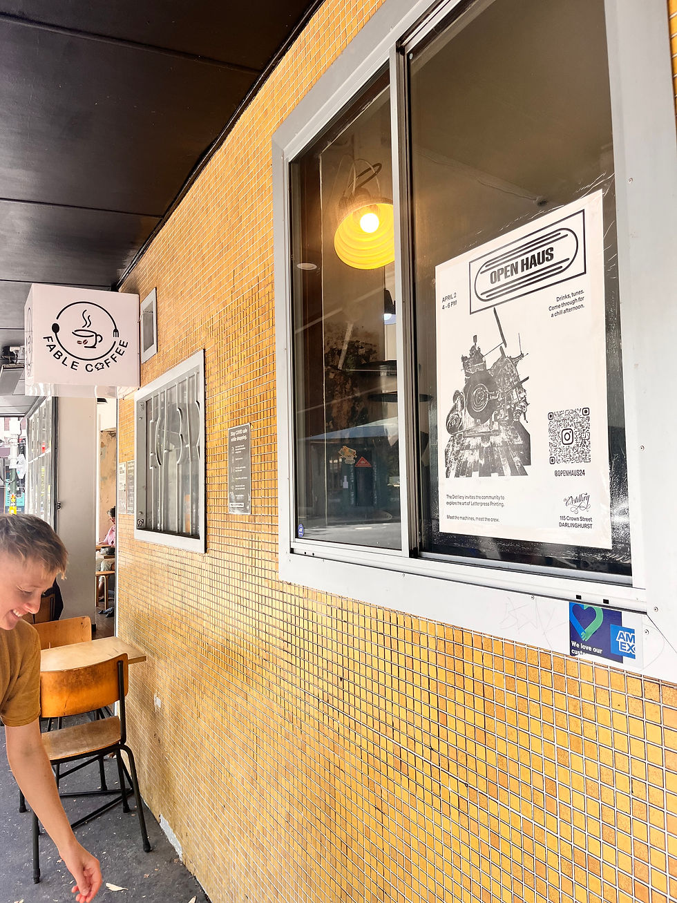
To extend reach, we designed and typeset promotional posters, prepared for letterpress deboss - merging digital design with traditional craft.

@openhaus24 - a dedicated event identity and Instagram presence designed to complement @thedistillery without compromising its established brand integrity. This sub-brand created space for visual experimentation while remaining strategically aligned.
MOTH MAGAZINE

This project explores text and image relationships in design. How they can connect, working together in the same visual identity.

Photography, typographic hierarchy and digital experimentation work together to build rhythm and tension across each spread.

A publication exploring text as image, influenced by the type we see in urban environments.
This project explores text and image relationships in design. How they can connect, working together in the same visual identity.
JOSH'S TALLO

Breaking from traditional cues, the brand uses satirical illustration and vibrant colour to reframe tallow with a playful, modern edge.

A fresh identity for Josh’s Tallo, an organic beef tallow cosmetic brand aimed at young, health-conscious consumers.
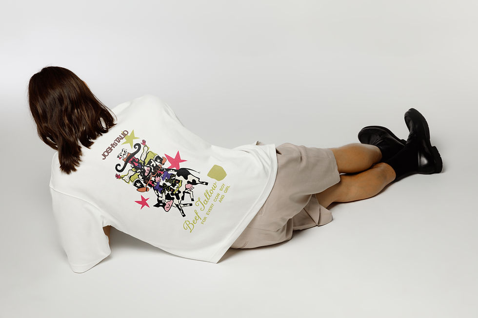
Designed for local markets and supported by merchandise, the visual language speaks to a youthful, alternative audience.
Breaking from traditional cues, the brand uses satirical illustration and vibrant colour to reframe tallow with a playful, modern edge.
PRINT DEAD PRINT

A typographic publication inspired by Tokyo Science, an obscure 1980s new wave band. Acts as a personal design statement and critique of digital immediacy.

Print Dead Print explores print and publication design within a modern industry. It explores industry perspective and possibilities for print design in the future. Print isn’t obsolete. It’s sacred.
A typographic publication inspired by Tokyo Science, an obscure 1980s new wave band. Acts as a personal design statement and critique of digital immediacy.
BANCO CHAMBERS

Visual identity selected in a studio-wide competition to mark Banco Chambers’ 20th anniversary, celebrated at Sydney Opera House. The design explores space and human connection through abstract geometry, layered depth, and use of colour. Developed as an artistically driven printed piece, the work reflects the iconic space, while sharing the client's legacy. Designed under the direction of The Distillery
Visual identity selected in a studio-wide competition to mark Banco Chambers’ 20th anniversary, celebrated at Sydney Opera House. The design explores space and human connection through abstract geometry, layered depth, and use of colour. Developed as an artistically driven printed piece, the work reflects the iconic space, while sharing the client's legacy. Designed under the direction of The Distillery
ANA AND ANDRE

An invitation suite designed for two architects seeking a balance of tradition and modernity. The brief: stationery that conveyed a sense of formality while sharing the couple’s romantic connection. The final outcome features a traditional typography paired with light modern design. A custom illustration was developed to compliment the typography, creating a cohesive and elevated visual language.
An invitation suite designed for two architects seeking a balance of tradition and modernity. The brief: stationery that conveyed a sense of formality while sharing the couple’s romantic connection. The final outcome features a traditional typography paired with light modern design. A custom illustration was developed to compliment the typography, creating a cohesive and elevated visual language.
GIRLS GIRLS GIRLS
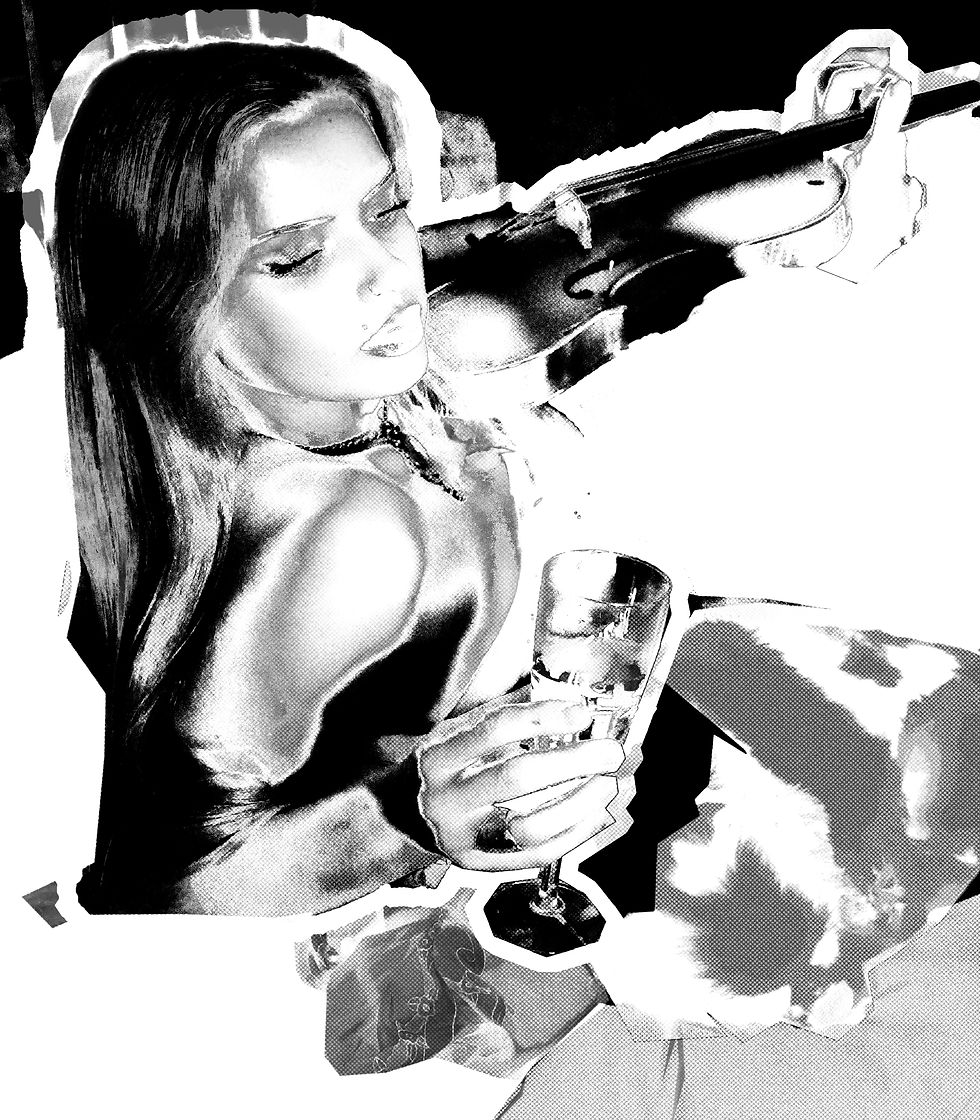
Diptych vol 2. zine Diptych is a poetry night / art exhibition / zine launch celebrating all things transient and changing.
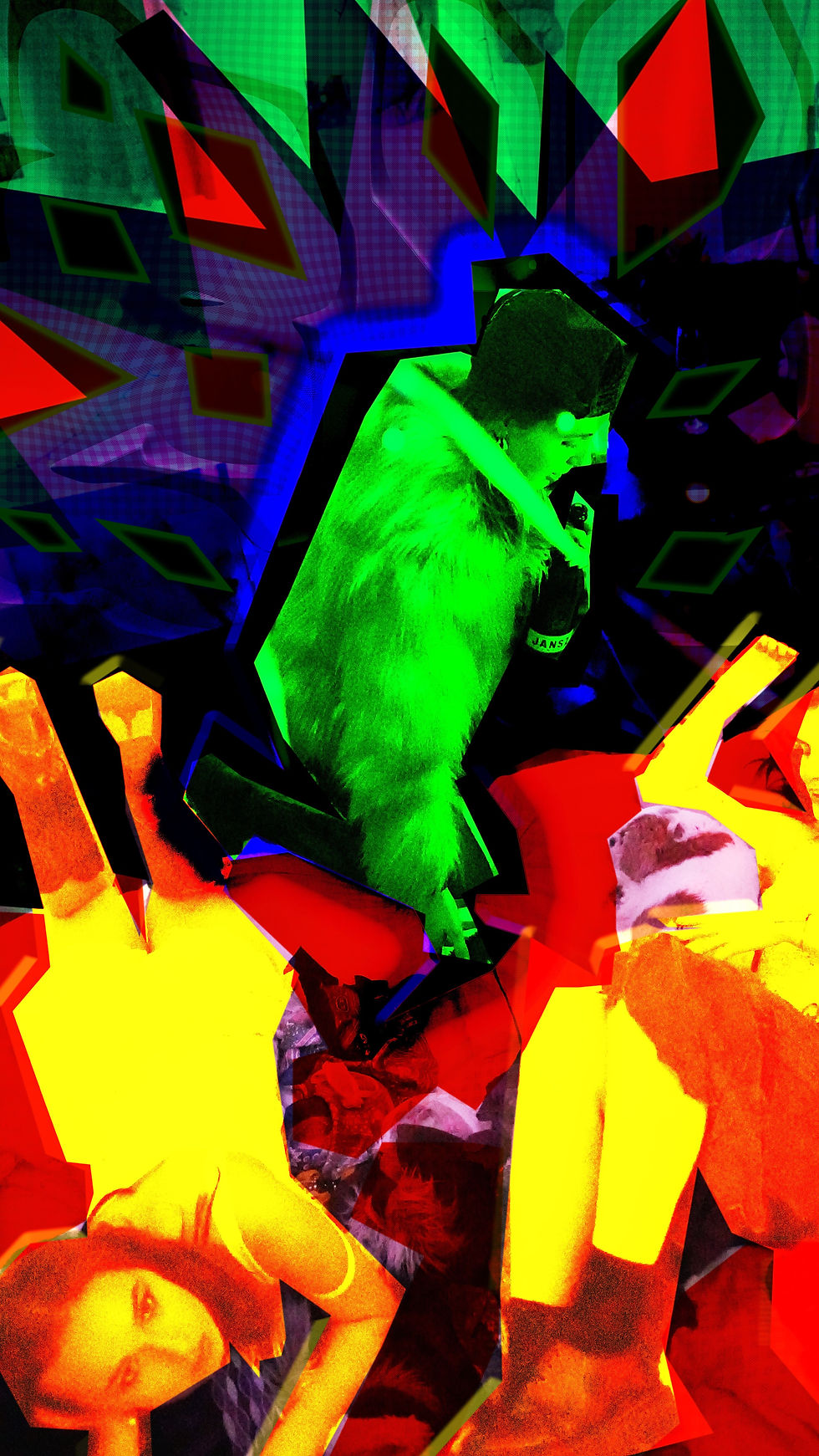
Diptych vol 2. zine Styling, photography and Photoshop were key in creating the beautiful chaos of female energy.

Diptych vol 2. zine Styling, photography, and manipulation used to build the emotional atmosphere.
Diptych vol 2. zine Diptych is a poetry night / art exhibition / zine launch celebrating all things transient and changing.
A VINDICATION OF CREATURE

This project re-imagined the opening and closing chapters of Mary Shelley’s Frankenstein (1818).

Focusing on visualising structural tension and feminist subtext.

This project re-imagined the opening and closing chapters of Mary Shelley’s Frankenstein (1818).
ARIEL

Poster design for Sydney based band.
Poster design for Sydney based band.
THE DISTILLERY CONTENT
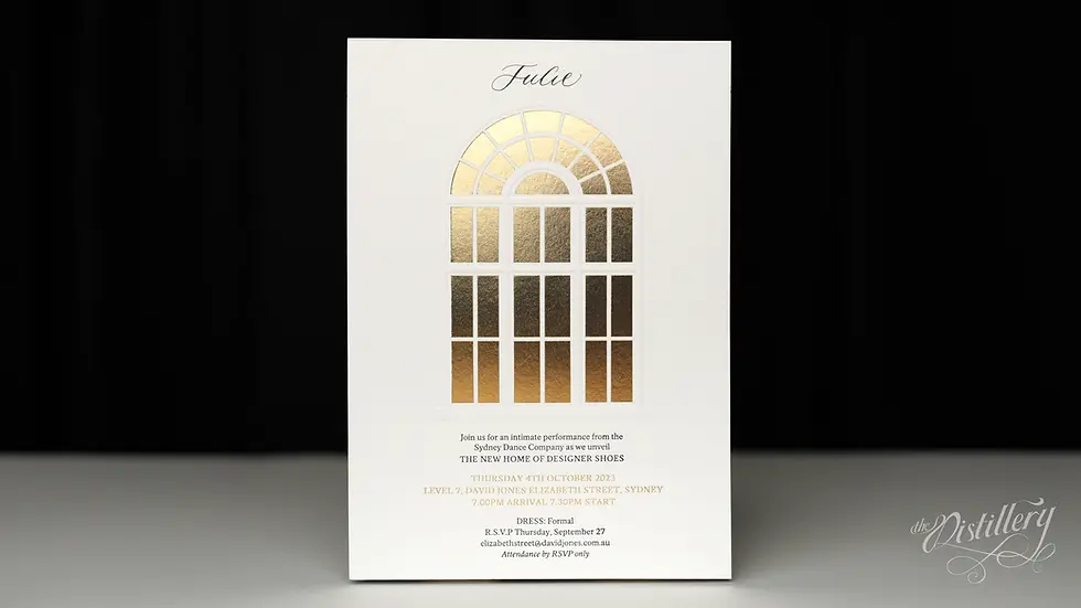
Role: Photography, Videography, Lighting, Staging, & Colour Correction. Created under the direction of The Distillery

Role: Photography, Videography, Lighting, Staging, & Colour Correction. Created under the direction of The Distillery

Role: Photography, Videography, Lighting, Staging, & Colour Correction. Created under the direction of The Distillery
Role: Photography, Videography, Lighting, Staging, & Colour Correction. Created under the direction of The Distillery

